
Friday, 18 November 2011
Final Version - Double Page Spread
This is the final version for my double page spread for the Music Magazine task. Overall I am happy with the way it came out and I tried to as best I could conform to the codes and conventions of double page spreads. Throughout the whole task I thought carefully about Gaze and Narrative Theory and tried to incorporate some of these aspects to my final product.

Final Version - Contents Page
This is the final version of my contents for the Music Magazine task. I feel that my product overall conforms to the codes and conventions of a modern hip-hop magazine and the feedback I recieved for it was good so I am pleased with the way it turned out. Based on my research, I took on the codes and conventions of music magazines and applied these to my work as best I could so that I would be left with a good quality product.


Final Version - Front Cover
This is the final version of my front cover for the Music Magazine task. Based on my research, I took on the codes and conventions of music magazines and applied these to my work as best I could so that I would be left with a good quality product.


Thursday, 17 November 2011
Final Evaluation
In what ways does your media product use, develop or challenge forms and conventions of real media products?
Being new to Media Studies, my goal in this task was to develop forms and conventions of real media products but instead was to learn from existing, popular media products and try to incorporate these things into my product as best I could. I did this through extensive primary research and being pro-active by finding out what my target liked about existing products. I did this by creating a questionnaire and was able to get all the information I needed down on paper and this played a big part in the development of my media product. To answer this question I would say that my media product does not develop forms and conventions of existing media products but instead learns and uses them. It does this in the way its laid out and the way the content is displayed on the page which goes back to Narrative Theory and how useful it can be. My product uses forms and conventions such as layout, house styles and overall iconography and I feel that this is what makes my product stand out as one of the better Hip-Hop magazines on the shelf.
The following links help answer this question by showing different magazines of the genre mine is based on, Hip-Hop. This is where some of my research took place and I feel that my product incorporates some of the features used in these magazines:
http://www.xxlmag.com/
http://www.magazine-agent.com/mens-health-best-life/magazine
http://www.thesource.com/
The image below shows the words used to describe the look and feel of my product by my target audience. The bigger the word, the more it was said by my target audience. The feedback given for this is in relation to the conformity of my product:


How does your media product represent particular social groups?
My media product represents represents a particular social and was only really aimed at one and that was Hip-Hop lovers. With Hip-Hop there is a specific social group, a specific type of people that will listen to that type of music and Hip-Hop has a distinctive nature in terms of the way people in that industry represent themselves and this is something I looked carefully at when creating my product and deciding what should be featured in it. I feel that my product carefully analyses 21st century media and incorporates this with the types of social groups that would follow Hip-Hop as a genre.
I originally recorded a "Vlog" for this question but had trouble uploading it. This was something I hadnt done before and tested my ICT skills. The "Vlog" answered this question in detail.
What kind of media institution might distribute your media product and why?
I feel that my magazine is very similar to Hip-Hop magazines such as Best Life and XXL. XXL for example is distributed by a company called Harris Publications and I think that after undergoing some research on this company they would be the kind of company I think might distribute my product.
Who would be the audience for your media product?
The perfect audience for my product would be teenagers and people around the age of 20. This seems like a vague target audience but my magazine has slightly mature themes and will attract readers of a wide age range. People of these ages would feel comfortable with this product as I got feedback from my target audience which told me these things.
How did you attract/address your audience?
I attracted my audience first of all by making sure my product related to them. I did this by carrying out research on what my target audience like and also gave out questionnaires to my audience so I could get this information first hand. This information was crucial to the development of my product and in the end I was able to give my target audience a good quality product that they could appreciate and enjoy.
In terms of addressing my audience I feel I did this be relating my magazine to things that would interest my target audience the most, things such as current affairs and light hearted segments. My research helped my realise that features like these in a magazine are what can make or break it and I feel that these things fit well in my product.
I originally recorded a "Vlog" for this question but had trouble uploading it. This was something I hadnt done before and tested my ICT skills. The "Vlog" answered this question in detail.
What have you learnt about technologies from the process of constructing this product?
Whilst creating my product I have learnt about many different types of programs and technologies such as Digital Cameras and editing programs such as Photoshop, Illustator and In Design. I have learnt not only how to use these things but ive learnt that all of these programs are needed to produce a proudct of high quality and without every one of these things I wouldnt have a product of the quality I do and it wouldnt be able to challenge forms and conventions of existing products.
Looking back at your preliminary task, what do you feel you have learnt in the progression from it to the full product?
Looking back at my preliminary task I have learnt a lot such as the skills and techniques needed to create high quality products such as these. I have learnt that without having a passion for media and the tasks your doing, it will be very difficult to create something that will appeal to your target audience. After this task I have a much greater respect for paper based media and the work that goes into it and I will hope that my skills will keep being challenged and refined so that I can continue to make products of a high standard.
Being new to Media Studies, my goal in this task was to develop forms and conventions of real media products but instead was to learn from existing, popular media products and try to incorporate these things into my product as best I could. I did this through extensive primary research and being pro-active by finding out what my target liked about existing products. I did this by creating a questionnaire and was able to get all the information I needed down on paper and this played a big part in the development of my media product. To answer this question I would say that my media product does not develop forms and conventions of existing media products but instead learns and uses them. It does this in the way its laid out and the way the content is displayed on the page which goes back to Narrative Theory and how useful it can be. My product uses forms and conventions such as layout, house styles and overall iconography and I feel that this is what makes my product stand out as one of the better Hip-Hop magazines on the shelf.
The following links help answer this question by showing different magazines of the genre mine is based on, Hip-Hop. This is where some of my research took place and I feel that my product incorporates some of the features used in these magazines:
http://www.xxlmag.com/
http://www.magazine-agent.com/mens-health-best-life/magazine
http://www.thesource.com/
The image below shows the words used to describe the look and feel of my product by my target audience. The bigger the word, the more it was said by my target audience. The feedback given for this is in relation to the conformity of my product:

How does your media product represent particular social groups?
My media product represents represents a particular social and was only really aimed at one and that was Hip-Hop lovers. With Hip-Hop there is a specific social group, a specific type of people that will listen to that type of music and Hip-Hop has a distinctive nature in terms of the way people in that industry represent themselves and this is something I looked carefully at when creating my product and deciding what should be featured in it. I feel that my product carefully analyses 21st century media and incorporates this with the types of social groups that would follow Hip-Hop as a genre.
I originally recorded a "Vlog" for this question but had trouble uploading it. This was something I hadnt done before and tested my ICT skills. The "Vlog" answered this question in detail.
What kind of media institution might distribute your media product and why?
I feel that my magazine is very similar to Hip-Hop magazines such as Best Life and XXL. XXL for example is distributed by a company called Harris Publications and I think that after undergoing some research on this company they would be the kind of company I think might distribute my product.
Who would be the audience for your media product?
The perfect audience for my product would be teenagers and people around the age of 20. This seems like a vague target audience but my magazine has slightly mature themes and will attract readers of a wide age range. People of these ages would feel comfortable with this product as I got feedback from my target audience which told me these things.
How did you attract/address your audience?
I attracted my audience first of all by making sure my product related to them. I did this by carrying out research on what my target audience like and also gave out questionnaires to my audience so I could get this information first hand. This information was crucial to the development of my product and in the end I was able to give my target audience a good quality product that they could appreciate and enjoy.
In terms of addressing my audience I feel I did this be relating my magazine to things that would interest my target audience the most, things such as current affairs and light hearted segments. My research helped my realise that features like these in a magazine are what can make or break it and I feel that these things fit well in my product.
I originally recorded a "Vlog" for this question but had trouble uploading it. This was something I hadnt done before and tested my ICT skills. The "Vlog" answered this question in detail.
What have you learnt about technologies from the process of constructing this product?
Whilst creating my product I have learnt about many different types of programs and technologies such as Digital Cameras and editing programs such as Photoshop, Illustator and In Design. I have learnt not only how to use these things but ive learnt that all of these programs are needed to produce a proudct of high quality and without every one of these things I wouldnt have a product of the quality I do and it wouldnt be able to challenge forms and conventions of existing products.
Looking back at your preliminary task, what do you feel you have learnt in the progression from it to the full product?
Looking back at my preliminary task I have learnt a lot such as the skills and techniques needed to create high quality products such as these. I have learnt that without having a passion for media and the tasks your doing, it will be very difficult to create something that will appeal to your target audience. After this task I have a much greater respect for paper based media and the work that goes into it and I will hope that my skills will keep being challenged and refined so that I can continue to make products of a high standard.
Friday, 11 November 2011


Thursday, 10 November 2011
Time Management & Equipment Used
In this task I feel that I managed my time well and in turn ended up with a good quality product that conforms to the codes and conventions of a Hip-Hop magazine. I did this by setting myself specific tasks and giving myself time limits throughout. I found that this was essential in the production of my product and if I had done it any differently I wouldnt have been focussed enough and this would have lead to my product suffering.
I used equipment such as a digital camera (Cybershot DSC-W570) and used programs such as Adobe Illustrator, Photoshop and In Design to create my final product.


I used equipment such as a digital camera (Cybershot DSC-W570) and used programs such as Adobe Illustrator, Photoshop and In Design to create my final product.
Final Version - Double Page Spread
This is the final version for my double page spread for the Music Magazine task. Overall I am happy with the way it came out and I tried to as best I could conform to the codes and conventions of double page spreads. Throughout the whole task I thought carefully about Gaze and Narrative Theory and tried to incorporate some of these aspects to my final product.
Editing Images
Being new to Media, I underwent the process of editing images that I potentially wanted to include in my magazine front cover. I used a range of programs when it came to editing images to familiarise myself with them and find out which one I was most comfortable with.
In the end I used Adobe Photoshop to edit the image below as I felt I was most comfortable with this program and this is what I did concerning other photos that needed to edited.


In the end I used Adobe Photoshop to edit the image below as I felt I was most comfortable with this program and this is what I did concerning other photos that needed to edited.


Image Catalogue
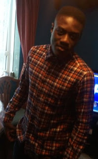
This is my image catalogue. I was hoping to use some or all of these image in my magazine whether it was on the front cover, contents page or double page spread. My model was Tetteh Johnson.


Some of these images were too busy and crowded in certain areas so I had to take some new images which would preferably be with a simple background behind them.
Drafts
I soon got down to creating my drafts on paper. I applied my research to my ideas as best I could to create a template that would conform to the codes and conventions of a modern music magazine. Taking Gaze Theory into consideration, I tried to incorporate things such as this to make my product the best I possibly could.
This is the development in my drafts for the front cover. They are listed as, Front Cover 1st Draft, 2nd Draft & 3rd Draft:


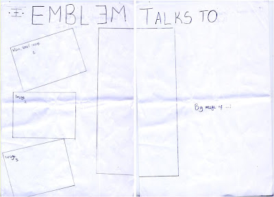
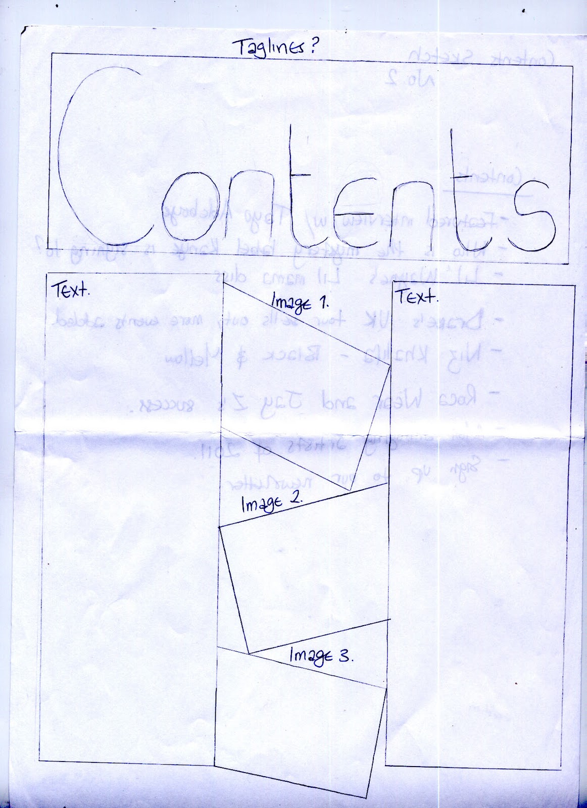
This is the development in my drafts for the contents page. They are listed as, Contents Page 1st Draft & 2nd Draft:


This is the development in my drafts for the front cover. They are listed as, Front Cover 1st Draft, 2nd Draft & 3rd Draft:


This is the development in my drafts for the contents page. They are listed as, Contents Page 1st Draft & 2nd Draft:

This is the development process in my drafts for the double page spread. There are 2 drafts altogether. 
The image below is my 2nd draft.

Questionnaire
To develop my research and make positive changes to my initial magazine ideas, I created a questionnaire that would give me a rough idea of what my target audience want. This questionnaire had to include things such as house style's, fonts and potential magazine names.
This questionnaire is aimed at young people ages 15 and up as this is my target audience and the people I want my magazine to appeal to. My questionnaire goes deeper and challenges my target audience as to what they want featured in the magazine and this is what my questionnaire looks like:

This questionnaire is aimed at young people ages 15 and up as this is my target audience and the people I want my magazine to appeal to. My questionnaire goes deeper and challenges my target audience as to what they want featured in the magazine and this is what my questionnaire looks like:


Feedback received from the questionnaire's I handed out was that the name Emblem was preferred to every other name on the list and this is the name I will be sticking with. I decided on names beginning only with 'E' and some that didn't begin with 'E'. This is because of the style of a rapper named 'Eminem' I saw whilst carrying out my research.

The next question being what font style did you most prefer, to my surprise a more simplistic font style was chosen by my target audience which was Font 3 and Font 6. This is something I will definitely consider including in my final product.
The third question was about colour schemes and the one that my target audience found most appealing was the first one which consisted of the colours black, red and yellow. I will be using these colours in my final product because its what they find most appealing. I will have to put some of my own preferences aside and focus mostly on what my target audience want.
The fourth question went a little deeper and asked a range of people from all ages what age group they thought I should aim my magazine at. This question at the time was dreamt up at a stage where I didn't know who I wanted my target audience to be but the feedback given showed me that people between the age of 16 and 21 would benefit most from a magazine of this genre.
The fifth and final question was somewhat different from the others. This question asked whether or not people thought that this magazine should have a specific subject, for example, dance or fashion. In the end the feedback given made me realise that this magazine should solely be about music.
Research - Double Page Spread
Different to the Preliminary Task I had to create a double page spread on a featured artist and to do this had to do some primary research into the codes and conventions of double page spreads and what methods they use to appeal to a reader more than any other page.
With Hip-Hop double page spreads in particular, a striking image is key and is something that draws the attention of their target audience. A typical convention of this also is a catchy title and an interesting interview.
If I was going to create a good, interesting double page spread, I was going to have to incorporate all of these things into my final product and began drawing up some drafts which I thought conformed to the codes and conventions of a double page spread. As I had no experience in creating a double page spread I thought it best that my product conformed to an existing media product.
Research - Contents Page
I did some research into contents pages and came away with some valuable information that would go towards my final product. Here is the research I did and some information into the layout, writing styles and overall iconography of them.
Contex Contents
 The contents in this page are effective because of the way they are laid out. The separate colours on each feature make it easier to read and the way it is separated into sections also make it stand out.
Contex Contents
The contents in this page are effective because of the way they are laid out. The separate colours on each feature make it easier to read and the way it is separated into sections also make it stand out.The word ‘contents’ has been changed to say ‘contex.’ This will apply to the reader of the magazine but I don’t think it would be effective to mine. For the style of magazine and the type of audience it aims to attract, something like this may help with that, but overall it fits in with the page and fits in with the codes and conventions of a contents page.
There is a strong key image for the contents page, this image is effective because it's big and stands out but doesn't take anything away from the contents page and its aim to inform the reader of what is in the magazine is the main image and it stands out next to the contents.
 Club NME Magazine Contents
 The style of this contents page is separate to the rest in its layout. The focal image on this page covers most of it whereas the actual contents have been pushed to side almost as if its been hidden. Its supposed to be the main feature on the page but it doesn't look that way.
 Club NME Magazine Contents
The contents in this page are quite large and fill a lot of the space on the page. Although this is what a contents page would do, there weren’t many contents on the page which doesn't necessarily encourage the reader to read on.
The focal image on this page isn't too big and doesn't take much attention away from the actual contents on the page. There is a clear caption on the top of the image which comes to be a part of the contents anyway. The style of this contents page has elements of Gaze Theory in it and will be sure to attract a specific audience.
The colour scheme which matches the Club NME logo is black and pink helping create a theme that the target audience for this magazine will understand. My research helped me realise that things like that have to be taken into careful consideration when creating my magazine and deciding who I will be aiming it at.
An additional feature not commonly used in magazines is the voucher that has been placed at the bottom of the page. This is something that would attract anyone, not just a specific target audience and this is an effective well thought out feature that has been included.
Q Contents
 The style of this contents page is separate to the rest in its layout. The focal image on this page covers most of it whereas the actual contents have been pushed to side almost as if its been hidden. Its supposed to be the main feature on the page but it doesn't look that way.
A good thing about this page is that there is no dead space and the information is somewhat plentiful although the image on the page covers most of it.
Another feature that isn't always used in contents pages is the review section at the bottom of the page. This is something that may interest the reader of that particular genre and is something I should take into consideration when designing my final product.
Overall there is a lot to take away from these contents pages, some good and some bad. There is definitely a lot to think about when it comes to deciding what styles, layout or features I will want to include in my final product.
Research - Front Cover
These are some magazine covers relating to the genre I want to base my Music Magazine around, Hip Hop.
XXL Magazine
 The focal image on the front page is menacing and has so many qualities to it. The tattoos on the artist featured suggests a certain type of iconography that would be found in the world of Hip Hop. This magazine also uses Gaze and Reception Theory to draw their reader in, capture a specific audience and set the mood for the rest of the magazine.
This magazine is from The Source and unlike the other magazines there are lures aplenty! The focal image has elements of Gaze Theory to it but overall has different qualities entirely from the others.

Best Life Magazine
The strong iconography in this magazine by Best Life is one I aspire to emulate in my final product because of the styles that stand out on the page. This magazine in particular has a bold, striking focal image which reflects well off the bright red header and fits nicely in between the lures. The key image is strong and tall, covering the whole of the page. This is something that will attract Hip Hop lovers and encourage them to turn that page.
The strong iconography in this magazine by Best Life is one I aspire to emulate in my final product because of the styles that stand out on the page.
 This magazine in particular has a bold, striking focal image which reflects well off the bright red header and fits nicely in between the lures. The key image is strong and tall, covering the whole of the page. This is something that will attract Hip Hop lovers and encourage them to turn that page.
Having a white background can make anything look plain but this magazine uses it to make the information on top of it stand out. The focal image reflects off the background and stands out, giving the magazine lifelike qualities.
This magazine also encourages elements of Gaze Theory on this page alone with the clothes 'Jay-Z' is wearing. He is wearing a grey suit and a waistcoat encouraging the type of lifestyle he leads. Hip Hop lovers will want to live the life he does because of his status in the industry and this magazine cover encourages it.
XXL Magazine
This magazine by XXL features 'Eminem' as the focal image of their front cover. The header of this magazine is big and bold and stands out off the page ensuring the magazine will have a good shelf life as it can be spotted from a distance and at a great height.
 The focal image on the front page is menacing and has so many qualities to it. The tattoos on the artist featured suggests a certain type of iconography that would be found in the world of Hip Hop. This magazine also uses Gaze and Reception Theory to draw their reader in, capture a specific audience and set the mood for the rest of the magazine.
Another thing about the style of this magazine is the way the focal image stands out above the black background giving it lifelike qualities. The background matches the colour of 'Eminem's' eyes which adds to the sinister look of the image. His eyes are piercing and can in turn attract a particular audience as a complete package. This is where Reception Theory comes in and is the point where the target audience will be made due to a customers preferred, negotiated and oppositional reading.
The Source Magazine
The Source Magazine
This magazine is from The Source and unlike the other magazines there are lures aplenty! The focal image has elements of Gaze Theory to it but overall has different qualities entirely from the others.

This magazine has a big and bold header as well as a sub header that instantly draws the reader in depending on the magazine's genre and the star featured in it. The house style is red, which is consistent through out the page and even in the focal image. Another good point about the layout of the magazine is the positioning of the lures. Lures are meant to grab the readers attention but not take away from the most important information such as the header or focal image.
The bar code and pricing on this front cover is small but noticeable. It doesn't get in the way and as a convention of magazines, needs to be this way, noticeable but not attention grabbing.
NME Musical Express Magazine
NME Musical Express Magazine
This magazine is from a different genre and I chose to do some research on a magazine of a different genre because there might be some things I would be able to incorporate from it and include in my magazine.
Overall I have benefited from the research carried out and have gained more knowledge about the codes and conventions of not only magazines but of Hip Hop magazines also. This research will help me move forward in my production stages and without it I don't feel I would be as confident going forward with my product.

The front cover image is striking, with the eyes looking directly into the eyes of the reader. The grin on the ace of the person indicates that this magazine is tough and sends a message across to the reader. A striking image is a noticeable convention of magazines and I will be looking to do the same when creating my magazine.

The big bold name of the artist gives the reader an insight into what will be featured in the magazine. Lures on the left and right hand side also give a taster of what the magazine features. The lures fit around the image making the image the focal point of the front cover and gives the audience an indication into what artist is featured.
The offer of winning something in a competition can attract any type of audience and relates to anyone and everyone. A range of people will be targeted with the offer of a special prize in their magazine and this is what this magazine includes. A clever selling point used to rope a potential buyer in!
...and finally there is a small banner at the top of the page which is bold and bright with the title being small and fitting nicely around the image.
Wednesday, 9 November 2011
Preliminary Task
My previous task at the beginning of the year was to create a school magazine for Trinity School. To do this I had to gather information from my target audience as well as analyze the codes and conventions of a school magazine. My target audience for this task was KS4 and Sixth Form and I was able to get reliable information from them on how to go about designing my magazine and what should go in it.
Brief: To design and create the front cover and contents page for a school magazine aimed at pupils.
Brief: To design and create the front cover and contents page for a school magazine aimed at pupils.
For this task I did some research into school magazines and looked closely at the codes and conventions of them and then set about trying to apply this to my work. I researched school magazine front covers such as:


These school magazine front covers helped broaden my knowledge and I was able to spot the typical codes and conventions of a magazine and in particular, a school magazine. Whilst carrying out extensive primary research into the codes and conventions of particular parts of magazines and media theories such as Gaze Theory, I did some research into contents pages also:


Again, I was able to pick out the pros and cons of these school magazine contents pages and benefited from this research. I then moved on and thought of a way to get some feedback on my ideas from my target audience and decided to create a questionnaire which posed questions specific to the ideas I had. The feedback I received varied and some conflicted with the ideas I had and I was able to put some of my ideas aside for the benefit of my final product and was then able to take on the ideas given to me by my target audience. Below is the questionnaire I gave out to my target audience.

I also learned that constantly keeping in contact with your target audience and your peers is good because you can get constructive criticism which used in the right way can help aid your performance.
All of this is relevant because I was going to use these skills in the main task, the music magazine. I was going to have to remember all the skills I learned and the basic codes and conventions of a magazine.
While doing this task and being new to Media Studies I learned a range of different skills. I learned how to use Photoshop, In Design and Adobe Illustrator effectively. I learned how to apply primary and secondary research to my work. For example I created a questionnaire for my target audience to out and applied it to my work.
After this I felt confident creating my final product and began my hand drawn drafts. This is how they came out:


...and this is my final product:


Brief
For the main task I had to create a music magazine based on a genre of my choice. I had to create a front cover, a contents page and unlike the preliminary task, a double page spread on a featured artist of my choice. This meant that I had to collect images from my magazine and do some research not only on my target audience but on the codes and conventions within my genre of music magazine and other genres.
The genre I chose to use for my music magazine was Hip-Hop. I decided to do this because my favourite genre of music is Hip-Hop and I feel that this is the genre I can portray best in a magazine format.
Brief: Main task is to create the front page, contents and double page spread of a new music magazine (if done as a group task, each member of the group to produce an individual edition of the magazine, following the same house style). Maximum four members to a group.
Front Sheet
Candidate Name: Miles Addy
Candidate Number:
Centre Name: Trinity School
Centre Name: 14137
Unit G321:
Foundation Portfolio in Media (Hip-Hop Magazine)
Preliminary Task: School Magazine (Trinity Talks)
Main Task: Music Magazine (Emblem)
Subscribe to:
Comments (Atom)